A reader sent me some anime movie poster scans, for which I was grateful, but one of them just struck a nerve – a wrong nerve – and I have to vent.
Some day job background first – I pay the rent as a graphic designer for a performing arts non-profit. I’m faced with the constant challenge of how to represent large scale, grandiose stage productions in poster form, somehow getting across notions of a massive visual spectacle, classical music, high drama and emotion, and a theater-going experience being worth a hefty ticket price in a bad economy.
My budgets are modest and the visual assets at my disposal don’t often do the trick on their own – in short, I rarely have a home-run image landing on my lap, and have to get creative and conceptual to catch people’s eye.
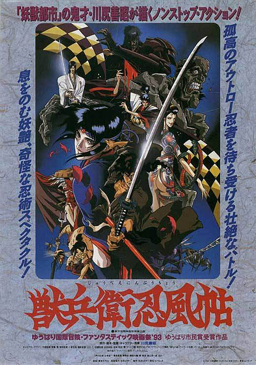
So with that background, what catches my eye? Something like this:
Seriously, what the hell am I looking at here? Ninja Scroll is certified classic, and anime movie posters don’t have to rely on photographic assets as their basis – the sky is the limit to the creativity of the illustrators involved. Yet what we have here is an absolute abortion.
Cluttered mess. Cluster of characters with no central focus on one main hero. Details details details everywhere making the frame so over-crowded you don’t know where to look. Nothing stands out. Nothing “reads.” Nothing is communicated. EPIC FAIL.
And it’s a ninja movie, there’s especially no excuse for this when you have sooooooo iconic a central character type.
Let’s look at some way better posters, mostly from movies nowhere near as good or important as the above.
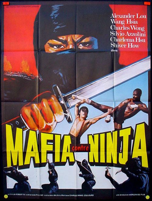
Mafia vs. Ninja is hardly the classic Ninja Scroll is, being a heart-worn-on-its-sleeve exploitation flick. But what the marketers of exploitation films know is how to draw the eye and deilver a quick, effective image that get’s someone to cue-up at a theater or grab a rental off a video store shelf.
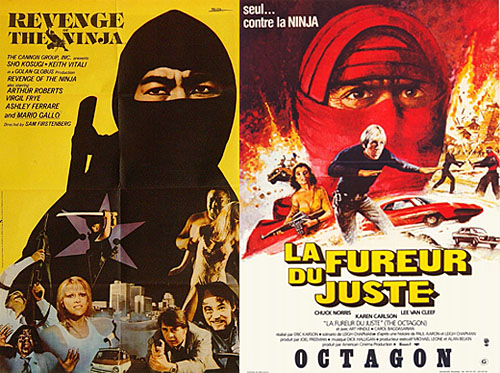
The secret here: put a BIG-ASS-NINJA-HEAD on your poster!
Not hard to do. You can see this is a ninja film from 50 yards away, and it works.
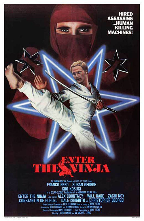
Here’s where that whole idea started, 1981’s genre-launching Enter the Ninja.
Two things going on here – cash in on the big-ass-ninja-head, and feature your expensive imported star, in this case Franco Nero.
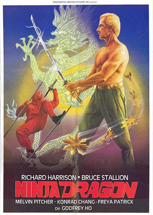
Another example of the same notions:
Nowhere near as effective, as the artist possibly wasn’t up to the task of portraying Richard Harrison more face-on. Red ninja on a tight-rope isn’t nearly as effective as big-ass-ninja-head, but the swirling dragon just screams ‘martial arts movie’ so this ends up working in spite of its inferior execution.
Now on the subject of clutter, it’s not always a bad thing. Take these for example:
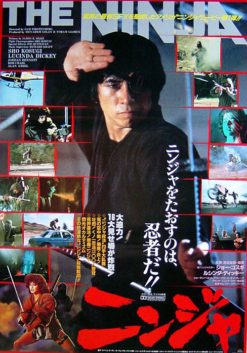
This Japanese market poster for Ninja III: The Domination “heroes” Sho Kosugi amidst a jumbled mess of images from the film. While not the greatest of layouts, a poster like this hangs in a theater lobby as an enticer for things to come. The audience is there, captive, milling about or waiting in line for snacks, so you have them on the hook already, you can get away with this sort of density.
The purpose of this poster is to relate the hero shot of Kosugi (in a Jubei Yagyu-like get-up that would be familiar to Japanese audiences) to the images of the clearly American film. They’re showing as much of the Hollywood stunts, effects and production values as they can, peppered with an American white girl.
They pull it off, but this is really pushing the clutter envelope. You can have a lot going on in a poster, especially for a fight film, but you need composition to organize it all for effective communication.
Like so:
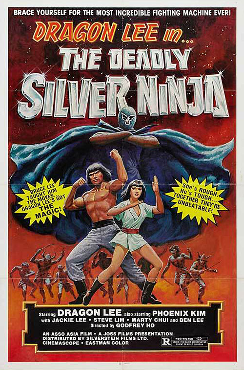
There are 12 or so warriors in this painting for The Deadly Silver Ninja, which is actually more than the Ninja Scroll poster. The artist, however, uses foreground and background to center your attention on three of those warriors – the hero, the hot chick and the exotic masked villain.
I don’t know who that El Santo-looking weirdo is, but I’m interested, because this poster is so well composed I know where to look. I can see what’s important there – muscly kung-fu dude, go-go girl without pants, strange meance hovering over both – with little effort. Even the long 4-word title comes across right. You can catch a sideways glance of this poster and know it’s a martial arts film about a Silver Ninja. WIN!
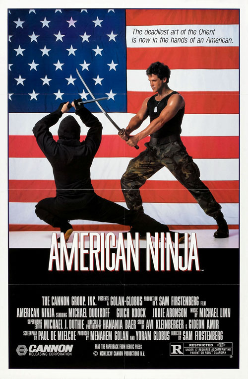
Composition can also save a much simpler layout. Take a look at the original U.S. market poster for American Ninja:
Great use of the flag, simple fight scene with two figures. All fine. But the ninja is sort of hidden here and it’s a very stiff arrangement. Clearly a studio posing and not a fight scene.
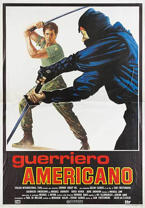
Now check out this painted Italian market poster:
Damn this thing is beautiful!
Here, an artist uses the limitless opportunity illustration affords to pose and arrange subjects to create a vastly superior version of essentially the same scene. Average Joe American Shinobi still reads as an exciting yank action star, but at the same time the ninja is a lot more prevalent. You’ve got movement, dynamic tension, intersecting lines. This is a fight scene!
But I still say when it comes to shinobi-cinema, you just can’t go wrong with BIG-ASS-NINJA-HEAD:
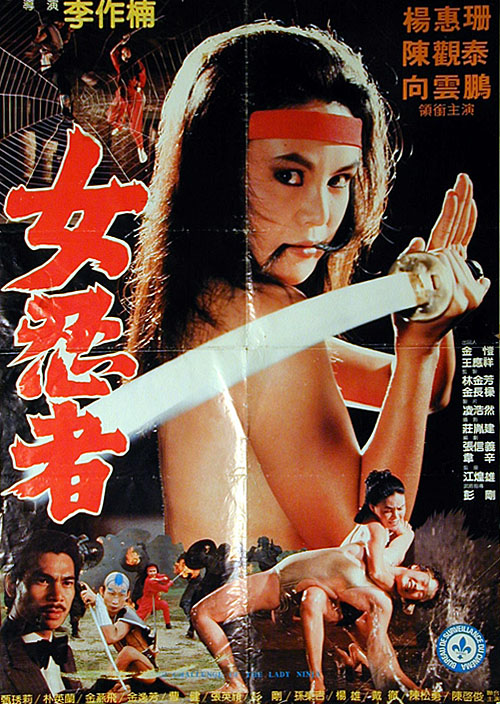
There’s only one thing that works better:
You can’t beat topless-broad-with-sword. Invincible technique. Flawless victory.
So now that you’re all experts too, let’s make sure not to unleash any more turds like that Ninja Scroll cluster-F that got me going…

Lee Drew
Yep, that last poster certainly got my attention! 🙂
RG
Yes, that what I thought about the NS poster literally other day!
Well, at least there were some more, like
http://bludragon.files.wordpress.com/2009/03/ninja-scroll-1.jpg
krainville
That one’s a lot better, but they’re still hiding Jubei for some reason…
schmrack
That Ninja Scroll poster is awesome! You are thinking way too much from the marketing-technique box. Im glad this poste is different than all those other posters. Also..dont exaggerate please.
krainville
It’s a marketing poster, of course I’m going to critique it from that aspect, and re-read the title of this post in the first place. Sorry man, I’m not telling you what to like, but I stand firm ground on all points made…