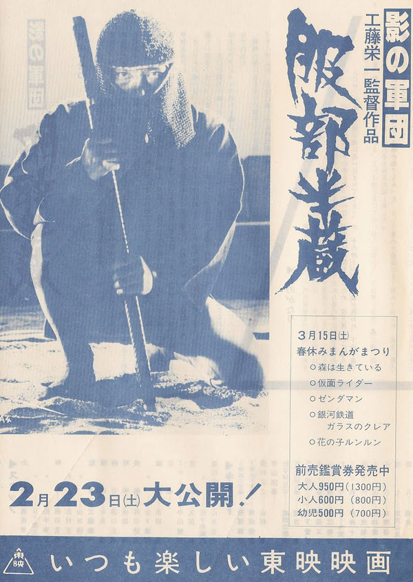
Here’s a vintage theater flyer sport an ad on the back for the 1979/1980 Eichi Kudo strangeness Kage no Gundan: Hattori Hanzo.
I’d have been more convinced to see this film by this flyer image than I would have been by the hideous movie poster with the tin-foil background seen here.
Lard Biscuit hates this film, and for good reason.
Paghat the Ratgirl is a little warmer, also for good reason.
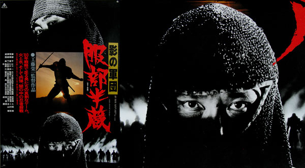
The Film on Paper poster archive has a nice feature on this superior version of the marketing, for GREAT reasons, I mean, look at that sweetness!
And for NO good reason, I myself don’t have a whole lot to say about this flick. I’ve sat down to rewatch and review it probably a half dozen times in the past few years, and just can’t get it right in my head. There is BRILLIANCE here, and from a visionary director. The massive building destruction set at the film’s climax is amazing. The notorious “football scene” should be experienced just for the sheer weirdness, and the tar-soaked Koga assassin bit is pure arthouse beauty.
Thing is, the rest of the film is inconsistent with those other notable scenes. Slow, plodding, depressing, sulking and pouting in its own grimness for grimness’s sake. I don’t know what he’s trying to say with this film, and where it lands between outré art trash and ironic brilliance is really up to every individual viewer.
So I guess this non-review IS my review. I’m as conflicted as the movie itself, so I’ll just default to outright day job mode and look at the graphic design and marketing aspects. Ignore the weird tin foil shit, and bask in what I’ve said over and over again on this site:
The best way to market a ninja movie is to put a giant awesome ninja head on the poster!
And two doesn’t hurt, either…


